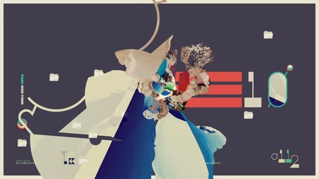
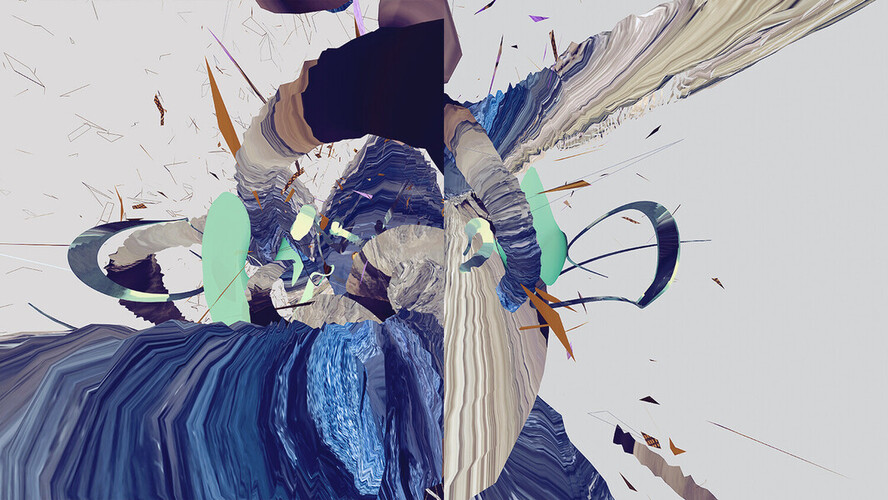
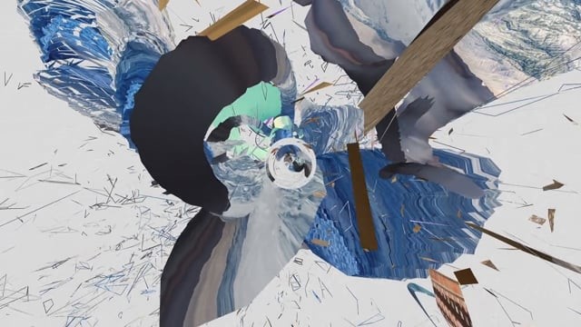
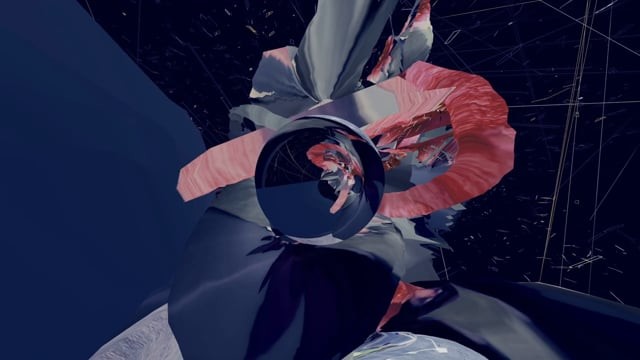
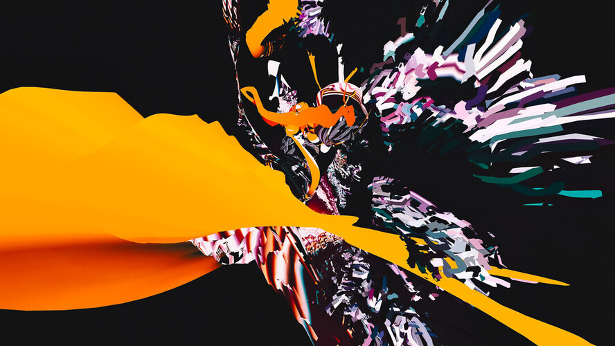
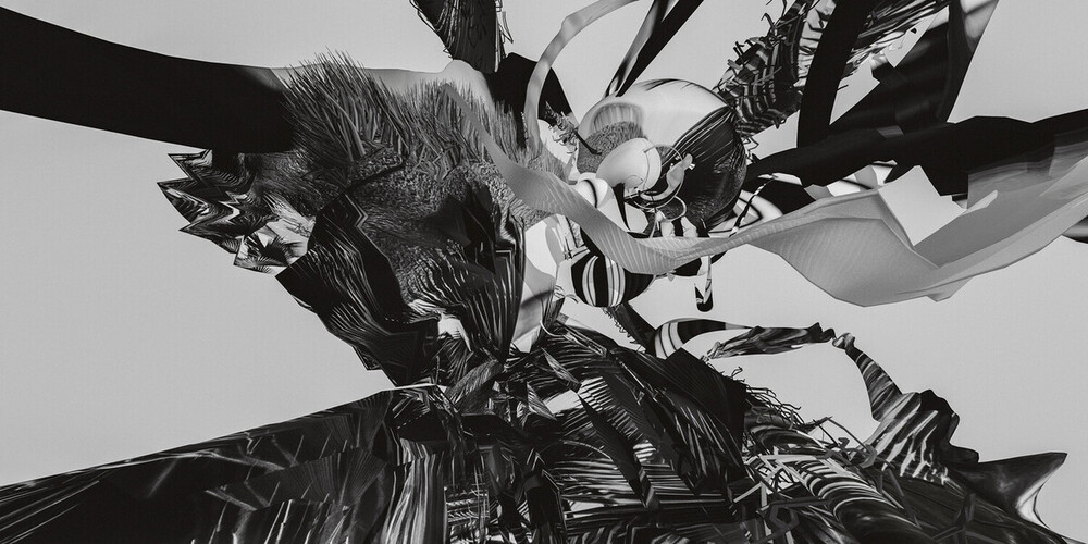
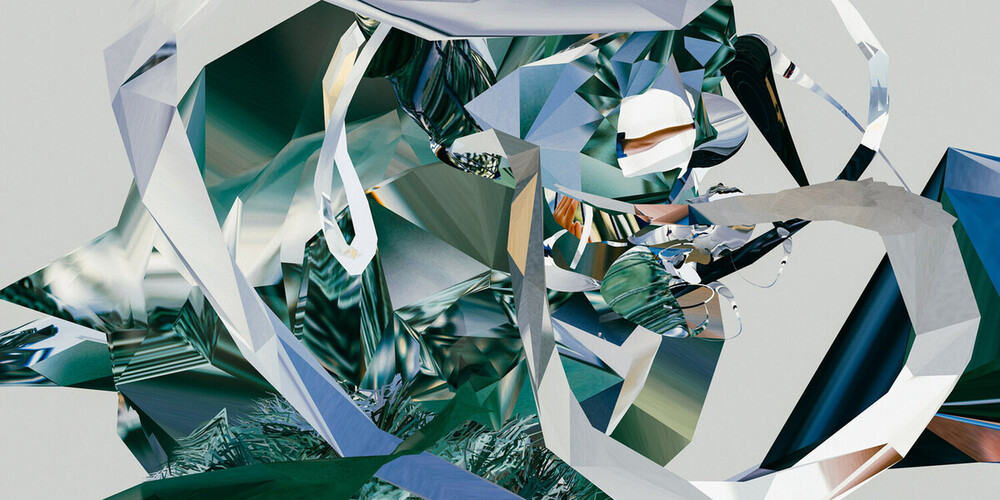
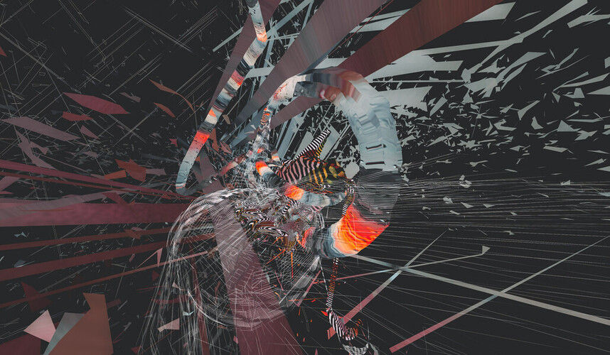
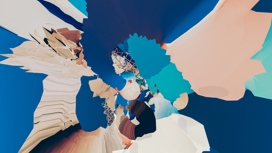
Operating SystemAbout a year ago (2014), I was asked to provide a design proposal to one of the world’s largest software companies, for their flagship product. While I’m precluded from telling you who it is, if you live on Earth, you’ve heard of them. It was a huge honor to even be asked to pitch, and of course a lot of things went through my head as I pondered how to best approach it.
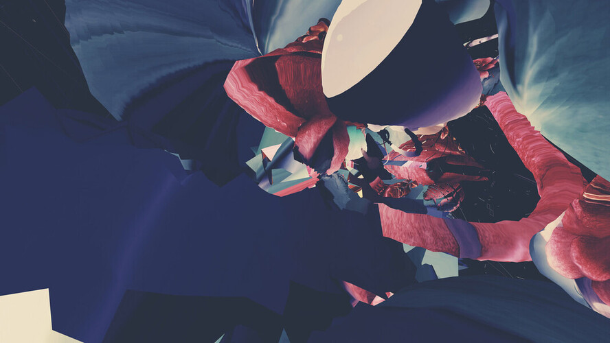
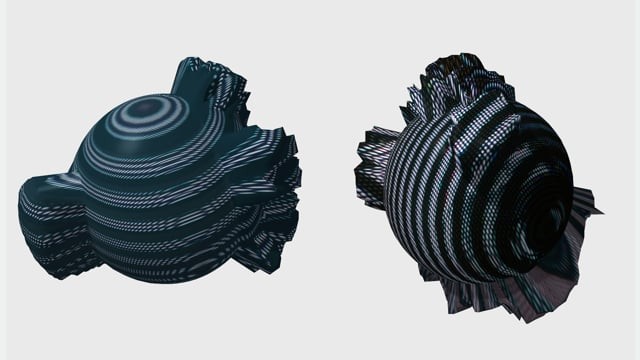
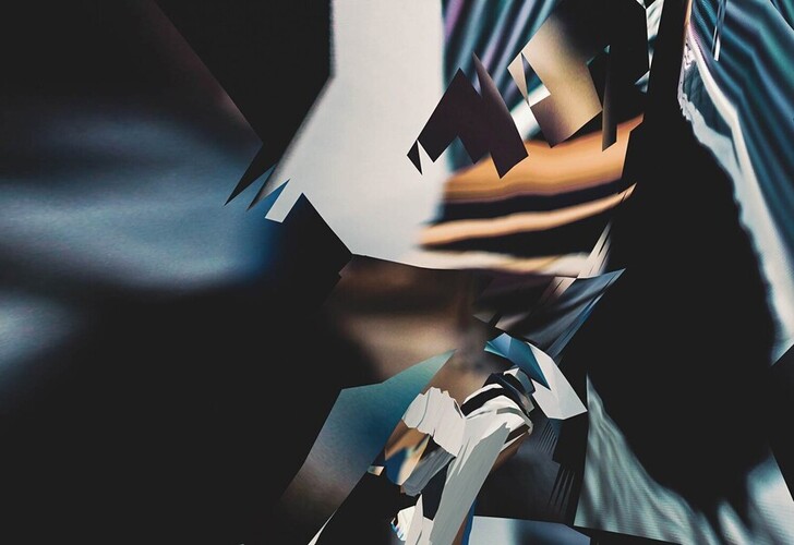
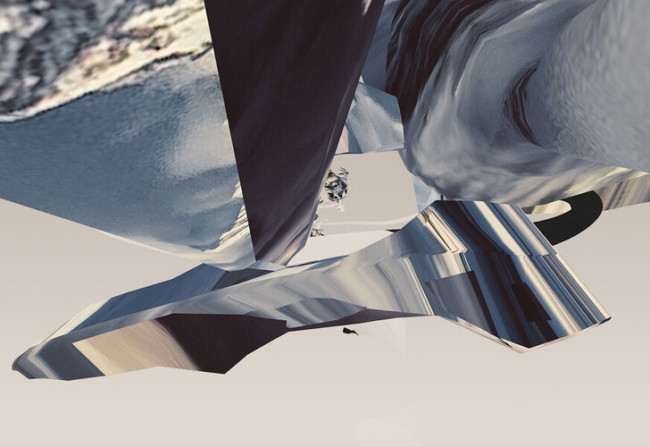
I felt strongly that, rather than doing anything that was preconceived or related to their existing brand, I should stay true to my own personal style, which resulted in some pretty wild visual ideas for the job at hand. The work was very emotional, imaginative, abstract, and all the color and forms (sharp or soft) are there based on my own thoughts for the subject. I envisioned that they would be animated, behind the company’s logo, across devices both on and offline.
As is often the case with abstracts, though, it’s hard to explain what it “means,” and I didn’t win the job…although a close friend did! It would have been much more alive than previous incarnations, in my opinion–this idea of everything being connected on a visual and movement-based level, within a core tech brand. In the end, the visual concepts were most likely just way too far into outer space for such a large commercial project, but I’m glad I didn’t censor my own conviction, even for one of the world’s largest.
More images: http://www.michaelpaulyoung.com/portfolio/operating-system-desktops/
Original Soundtrack by Madsound: http://madsound.com2019-10-18 09:40:15 